Accessible Flight Info Templates for Inclusive Travel
In an effort to further tend to the needs of passengers with disabilities, we are excited to introduce our latest set of templates carefully designed with accessibility in mind.
With these new templates, we're taking another important step toward ensuring that everyone, regardless of their abilities, can navigate your airport with ease and dignity.
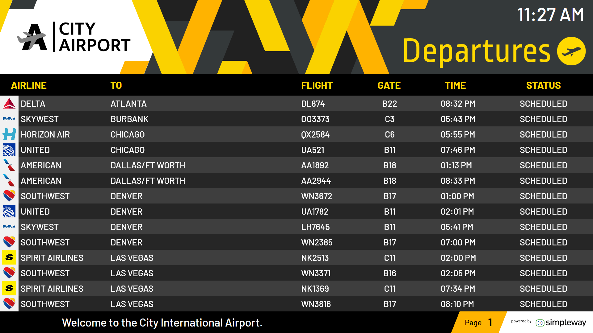
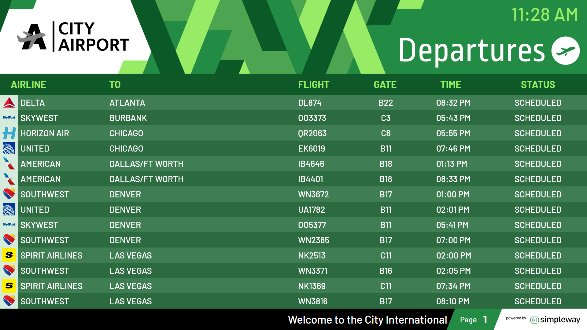
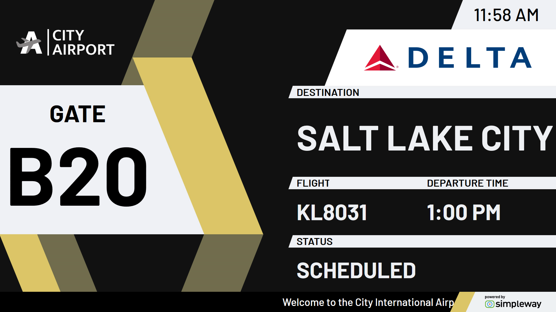
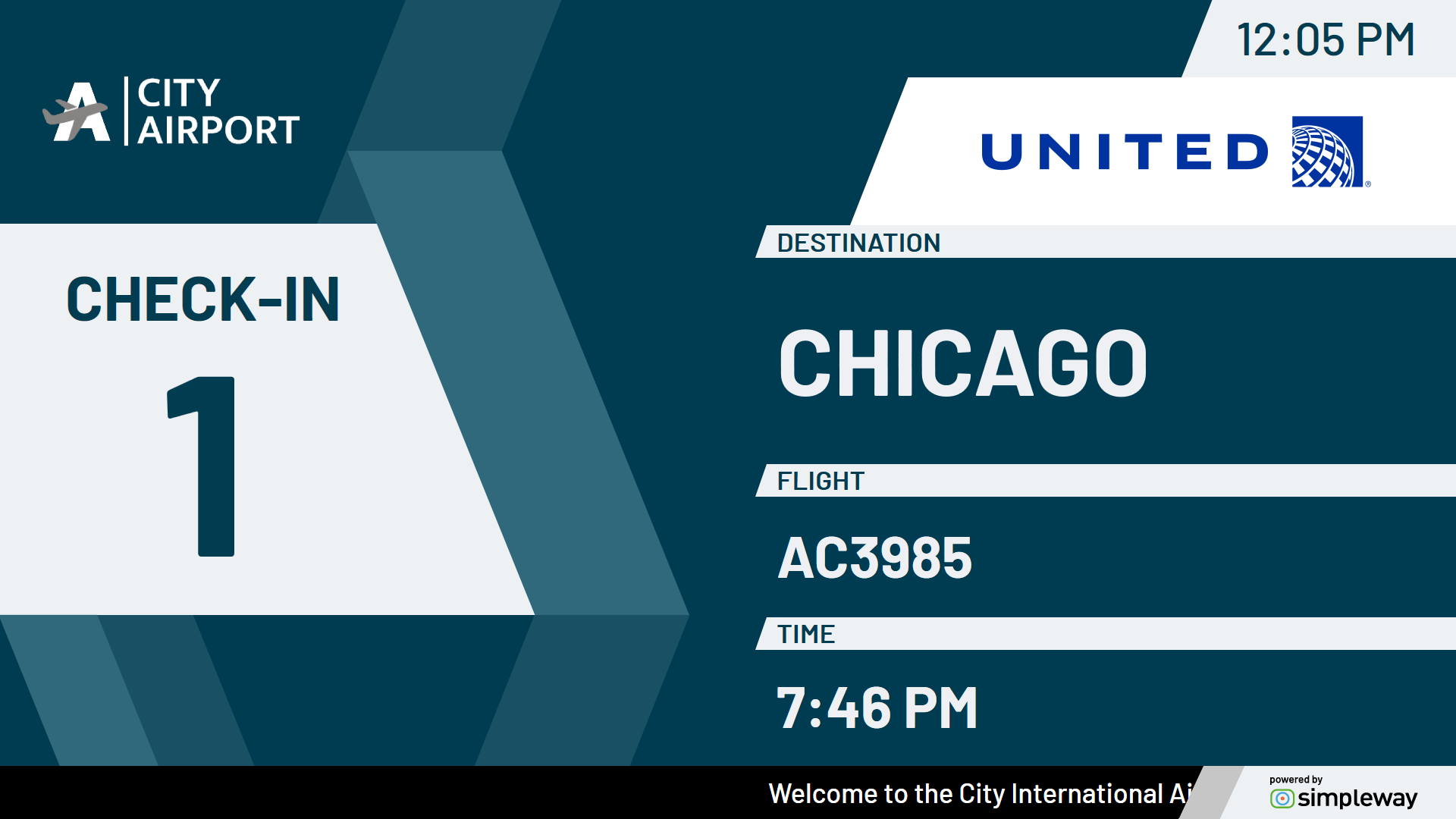
We understand the importance of creating a smooth and intuitive visual experience, so our templates prioritize clarity, consistency and accessibility across screens.
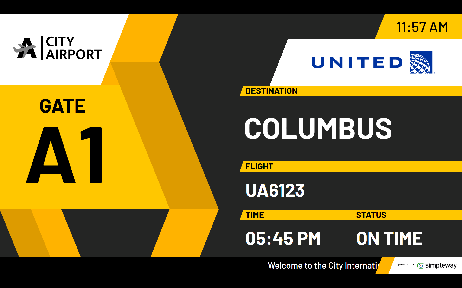
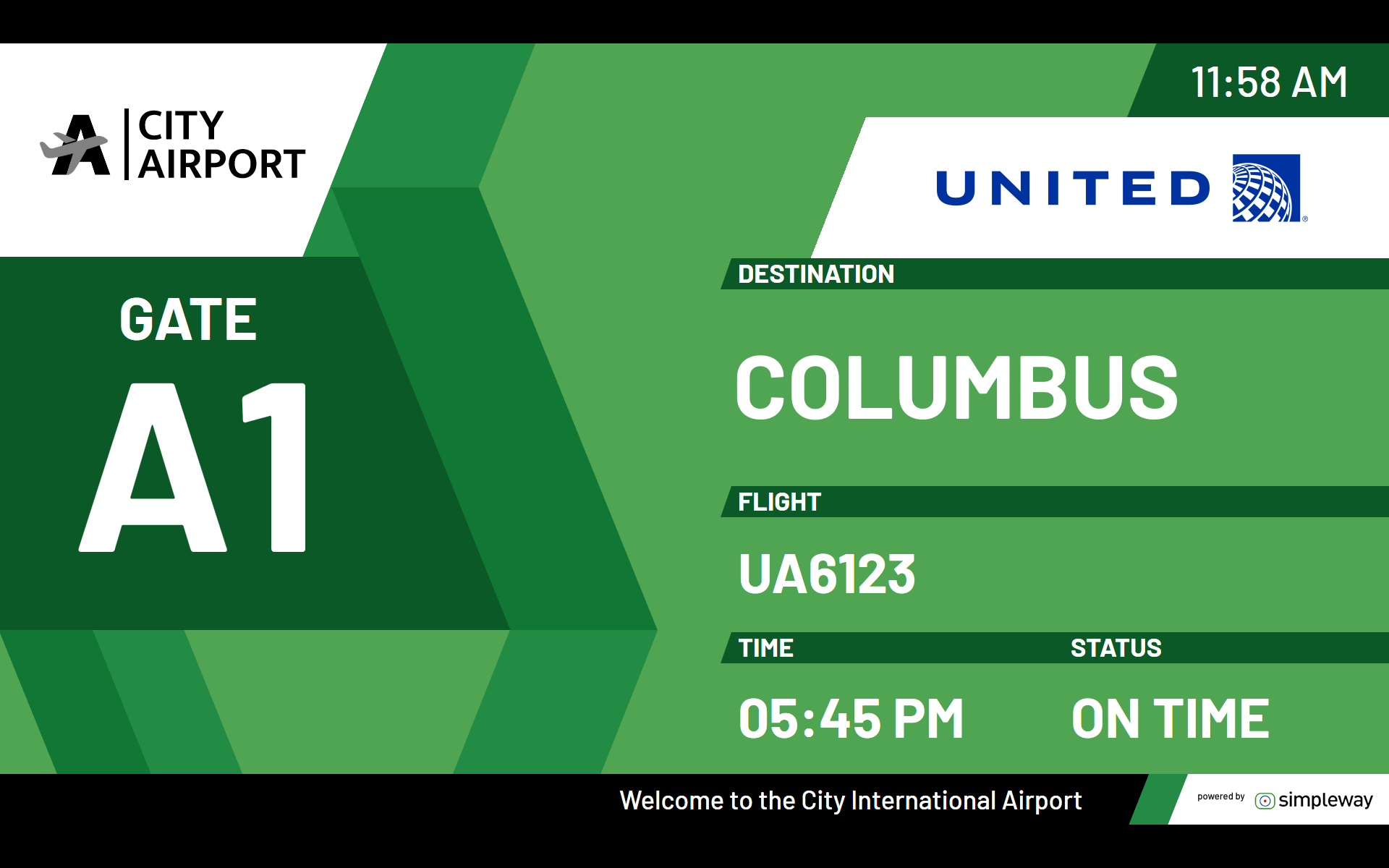
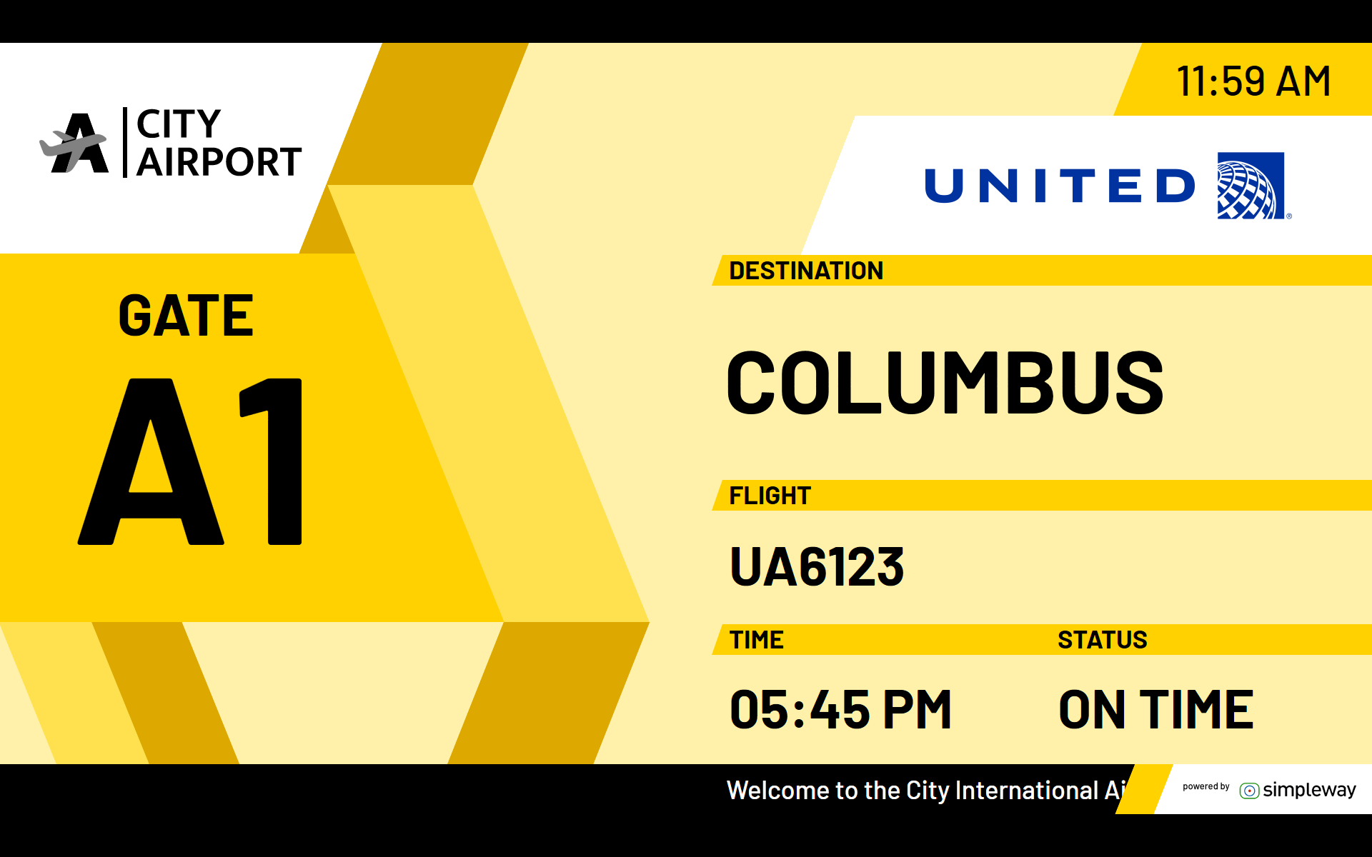
Whether passengers are browsing flight information, checking in or finding their gate, our templates will ensure that key text and images are clearly visible, even from a distance.
High contrast with style
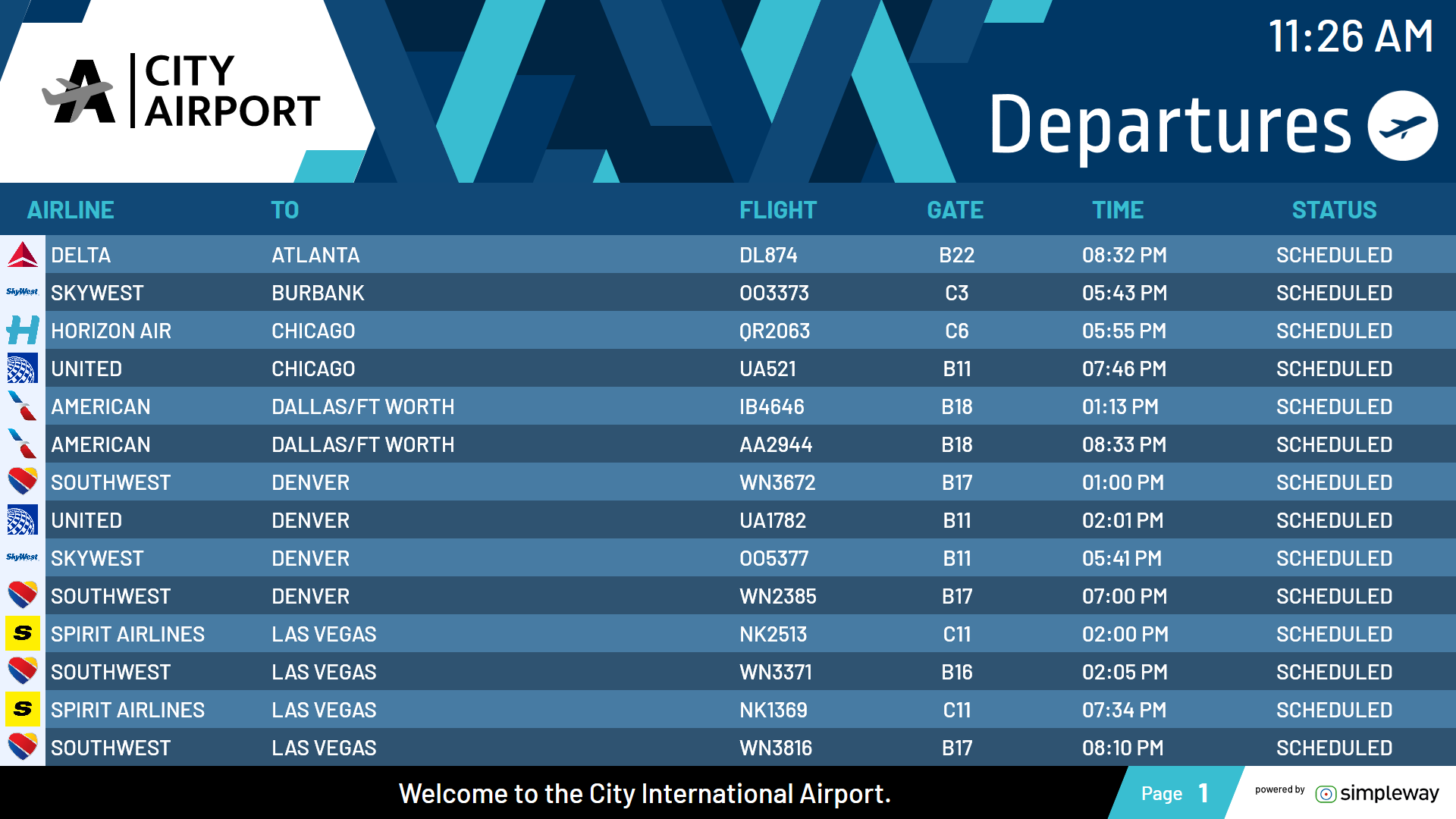
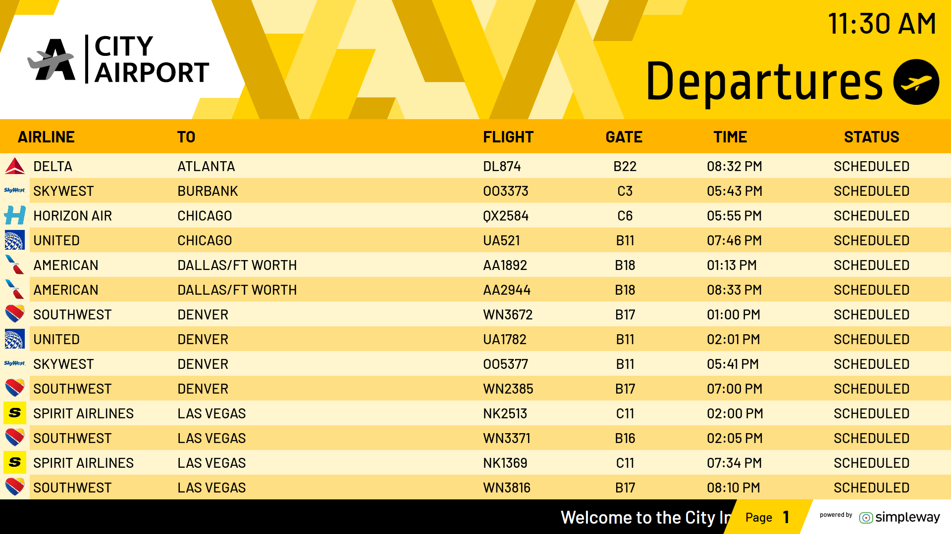
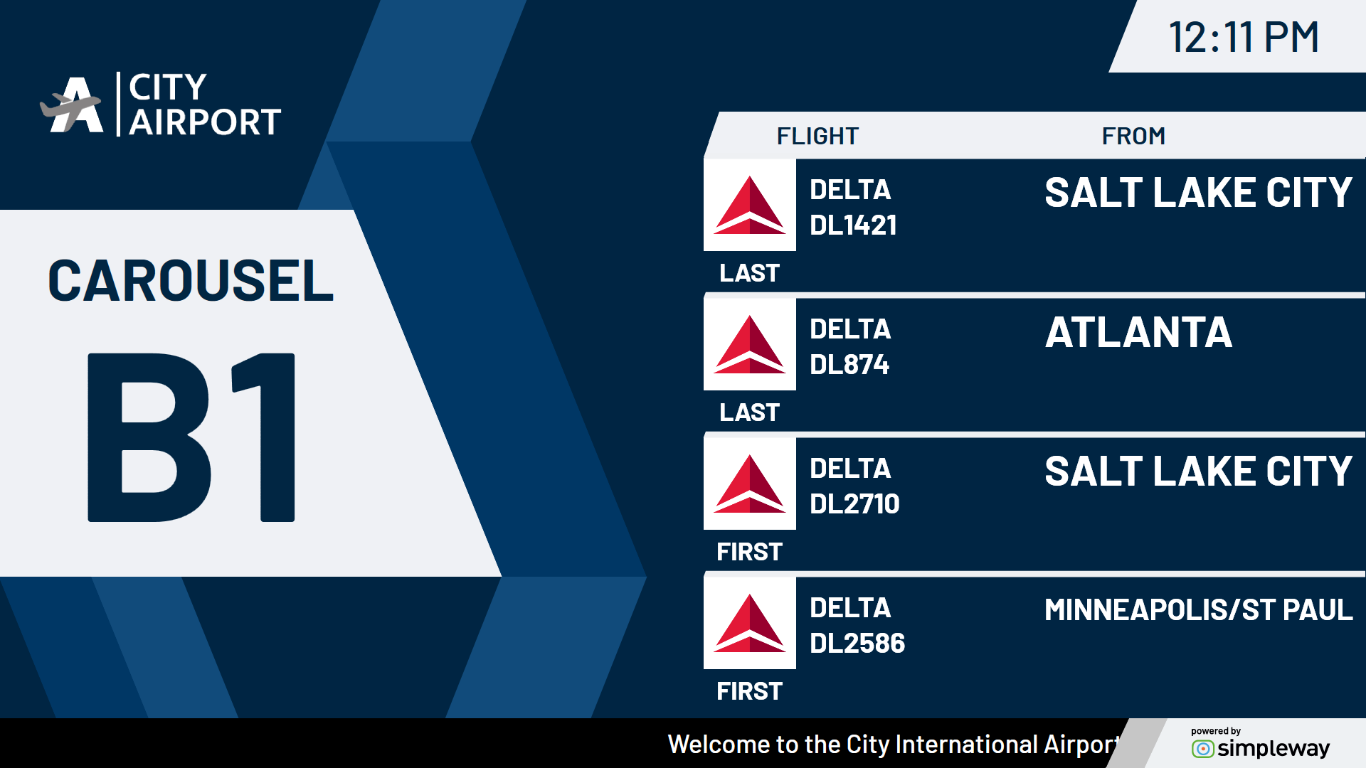
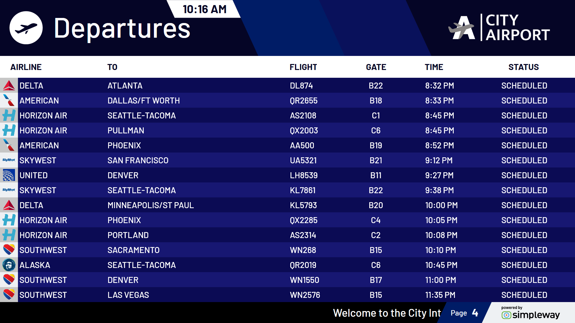
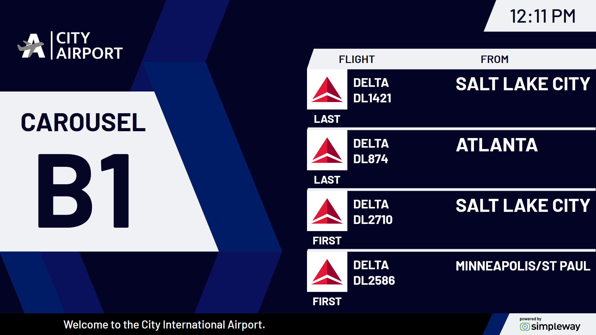
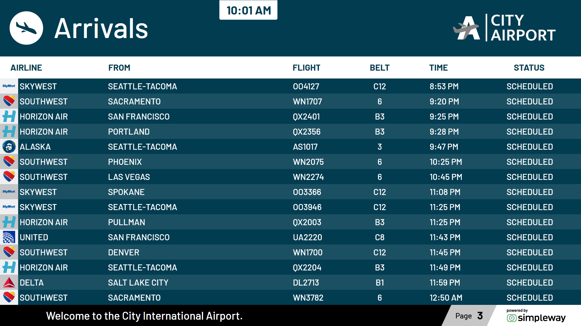
One of the key features of our new templates is their high-contrast design, which significantly improves readability for passengers with visual impairments, including colorblindness. The clear contrast between text and background elements not only improves visibility, but also minimizes the risk of confusion or misinterpretation of displayed content, thereby contributing to a more inclusive environment for all travelers.
Dual flight list on a single screen
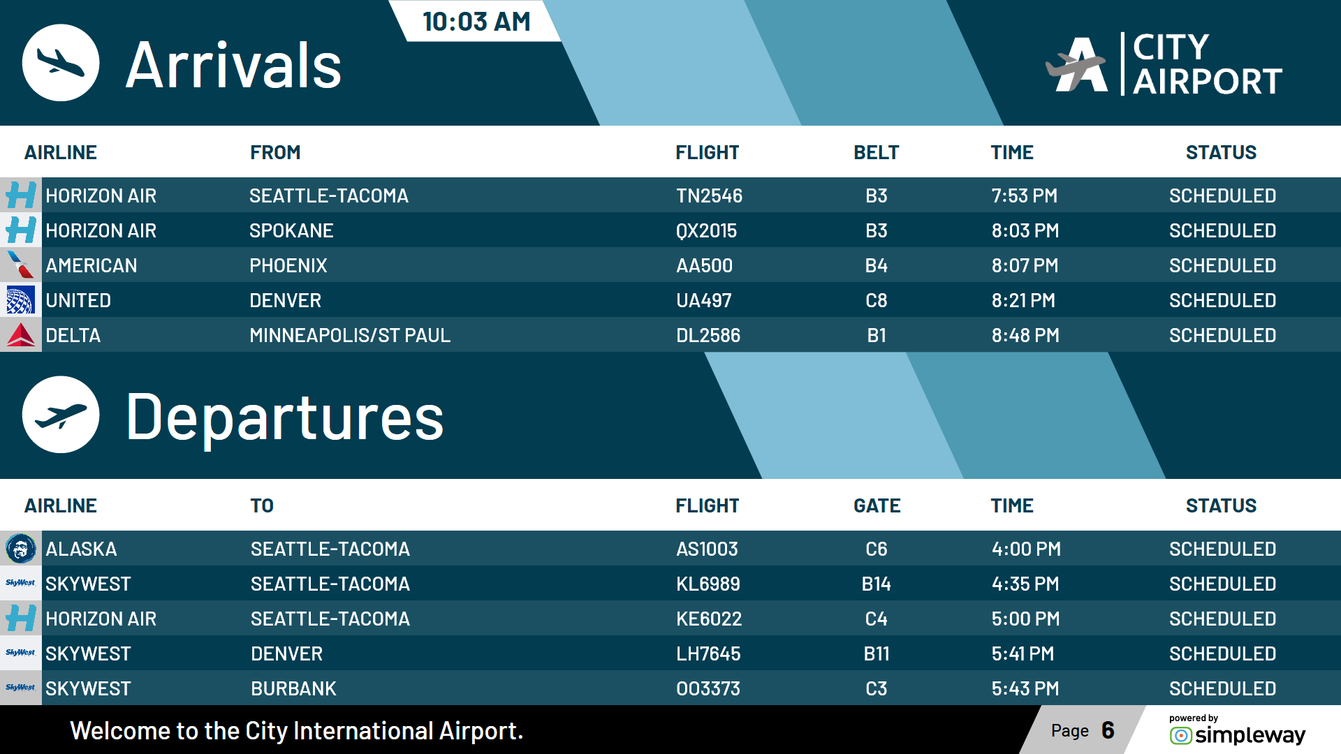
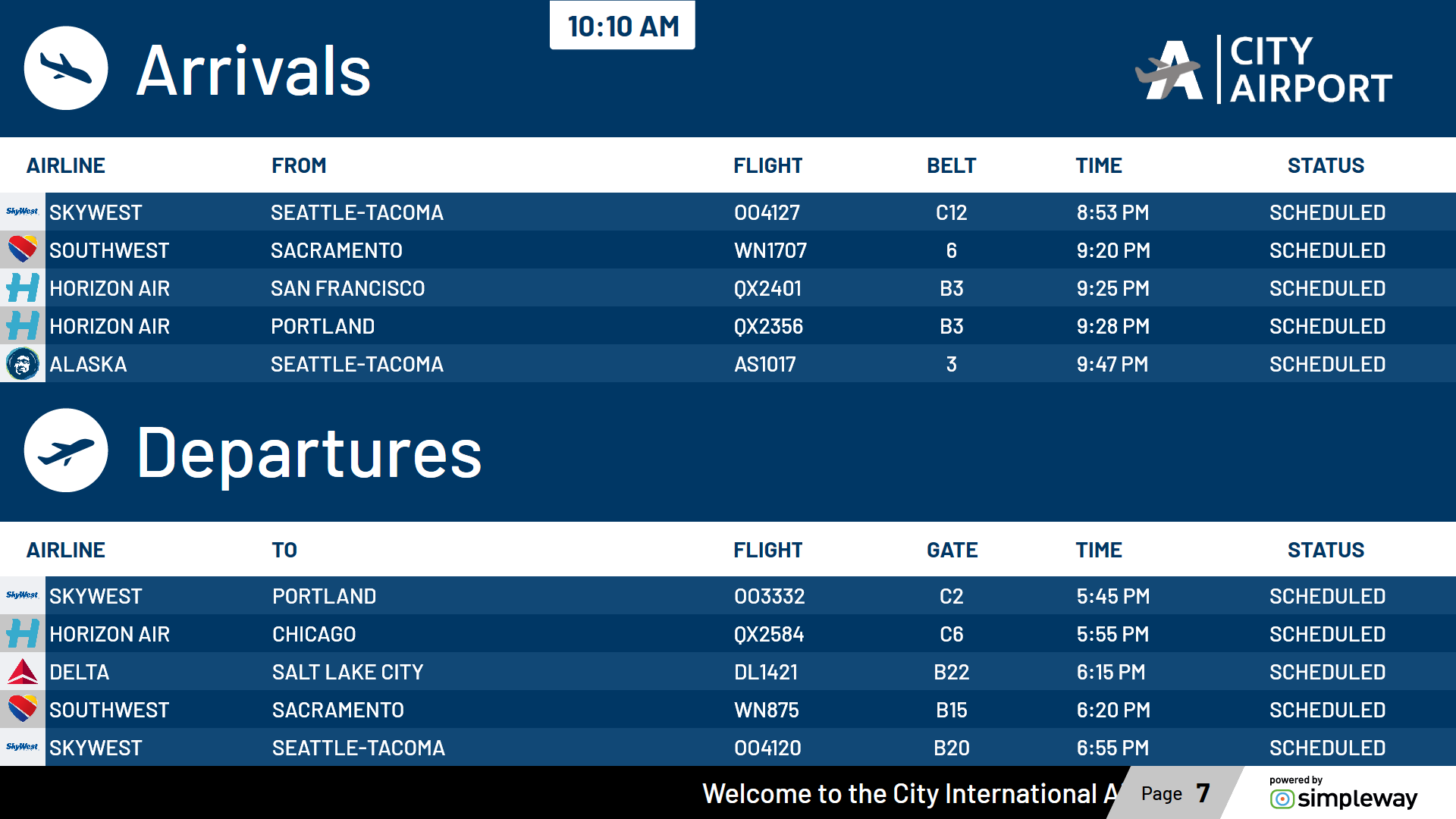
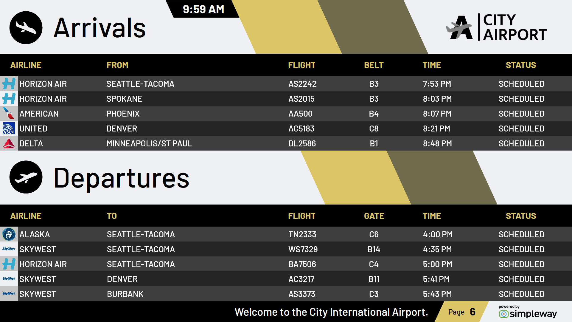
Our templates now include options to display departure and arrival flight lists simultaneously on the same screen, but as always, we can use other approaches to suit your requirements, such as displaying arrival and departure flight lists separately, with more rows of flight data, and switching between them at set intervals.
Scheduled time in the first column
The new template options now include flight lists with a modified column layout, where the first column shows the scheduled time. This adjustment aims to enhance the efficiency of information retrieval, ensuring that critical details are easily accessible and prominently displayed. That said, the layout of the flight list can be easily changed to suit your specific needs.
Change the boarding class information from your workstation
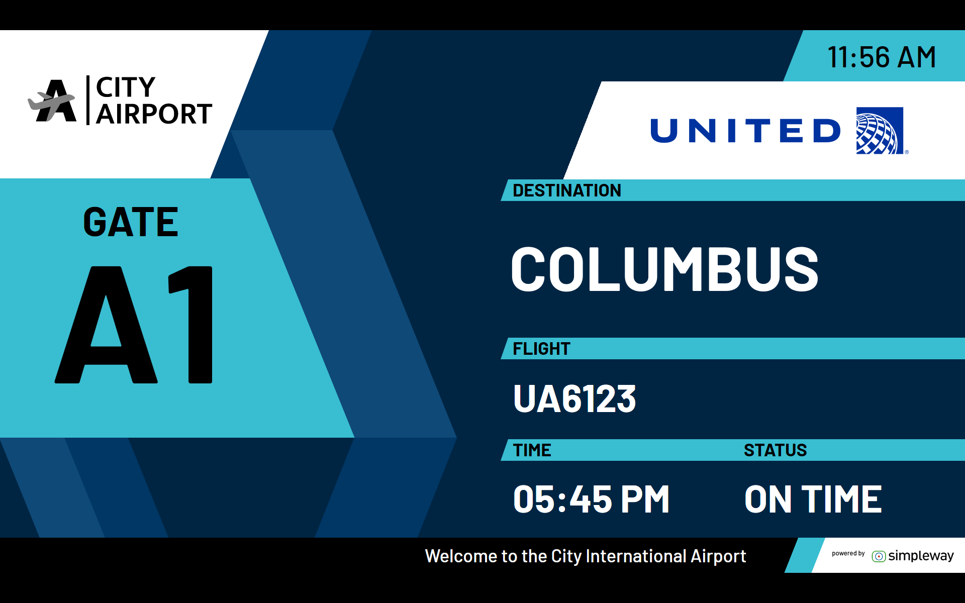
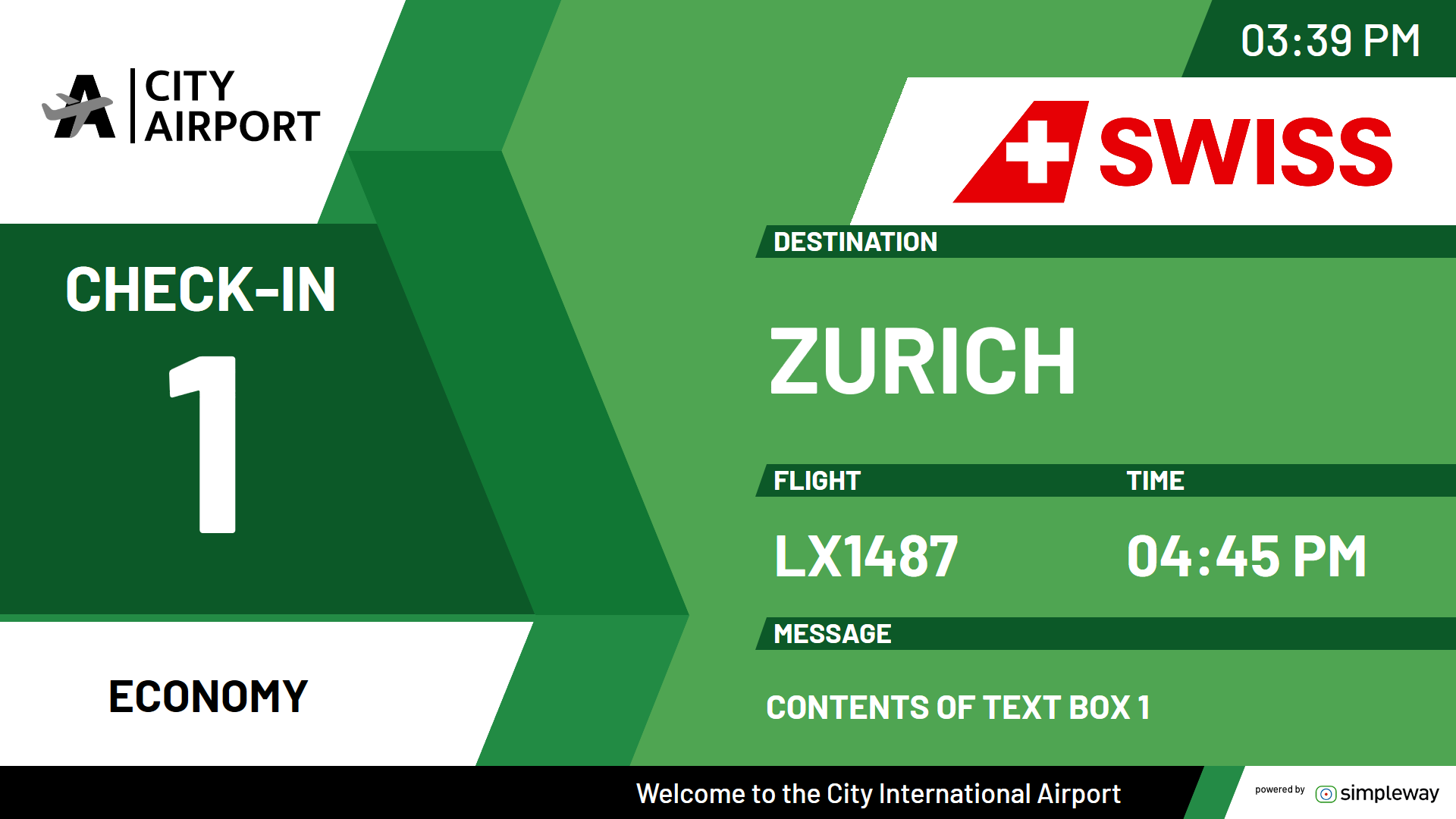
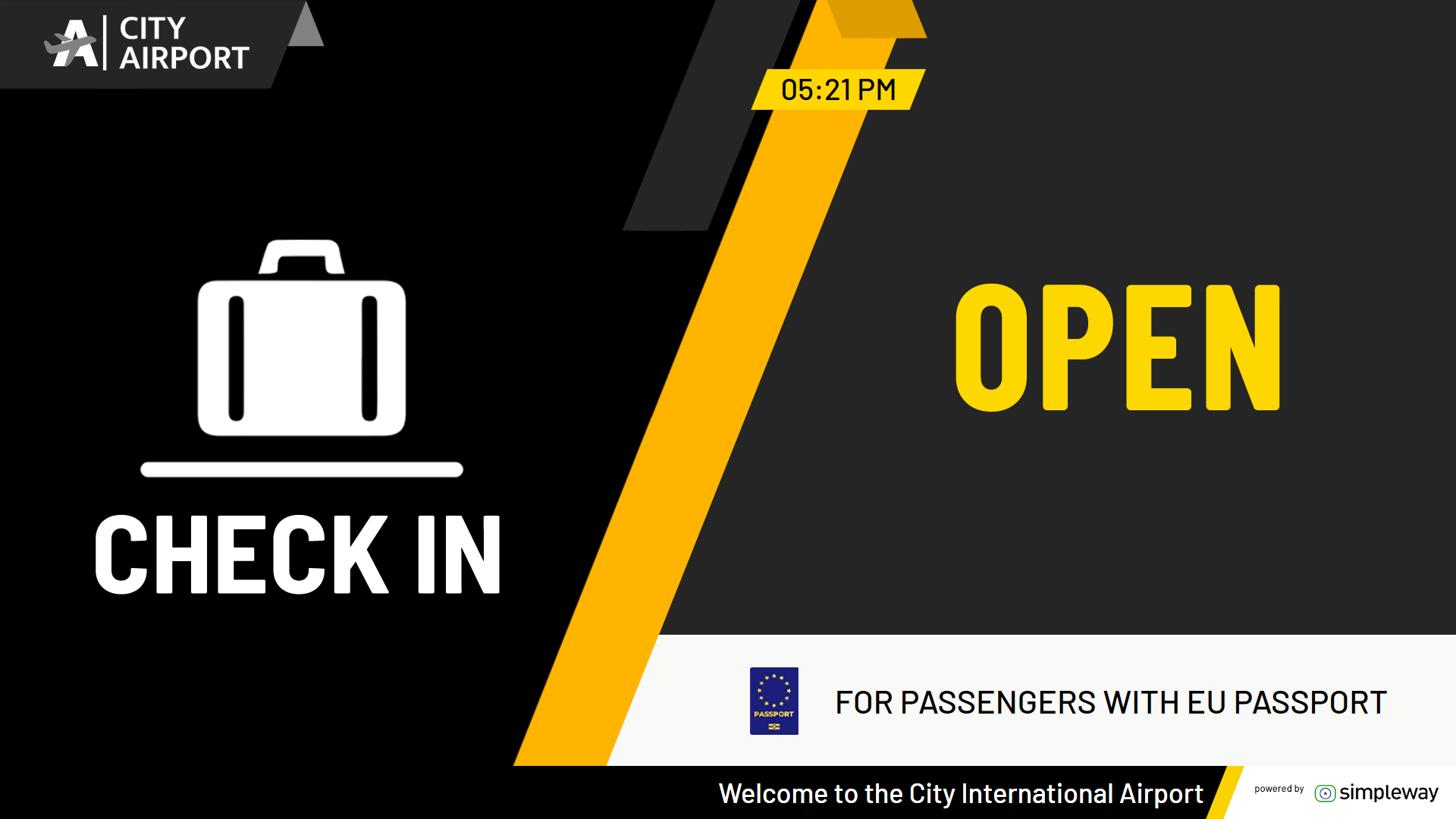
In addition, our latest Airport CX updates include new GateUI and CheckinUI features that allow operators of these interfaces to customize and compose visual messages directly at the check-in and gate counters. This allows operators to communicate important information such as flight class and boarding instructions on screens using our available templates. Using these new features, airports can optimize communication processes and improve the overall passenger experience.
In the following example, in addition to the usually provided flight information, you can also see the flight class displayed under the check-in number and a message informing passengers to prepare their passports and tickets, all set by the check-in operator directly from their desk.
Expected time in case of delay
There is a lot of functionality that we can implement in our templates. This example shows a situation where a flight is delayed and our templates automatically update the flight status to show the expected time.
This real-time information empowers passengers to stay informed and make informed decisions, thereby reducing stress and uncertainty during their travel experience.
Wayfinding
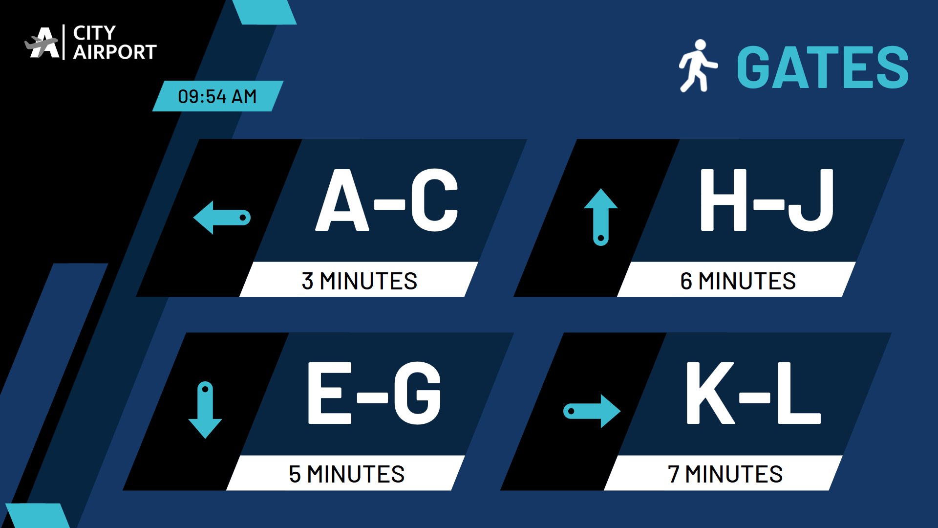
Our new wayfinding templates for orientation information displays offer both manual operation and automatic adjustment based on arriving and departing flights, providing passengers with real-time navigation through the terminal in the required languages. Passengers with the right information can make informed decisions as well as easily navigate through the terminal. Use our smart dynamic wayfinding contents instead of static signs.
Online library
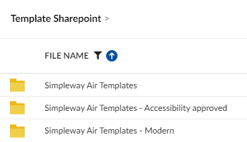
Navigating our extensive collection of templates is easier than ever. Simply visit the Templates tab in your Airport CX instance, where you'll find an online library showcasing our approved themes.
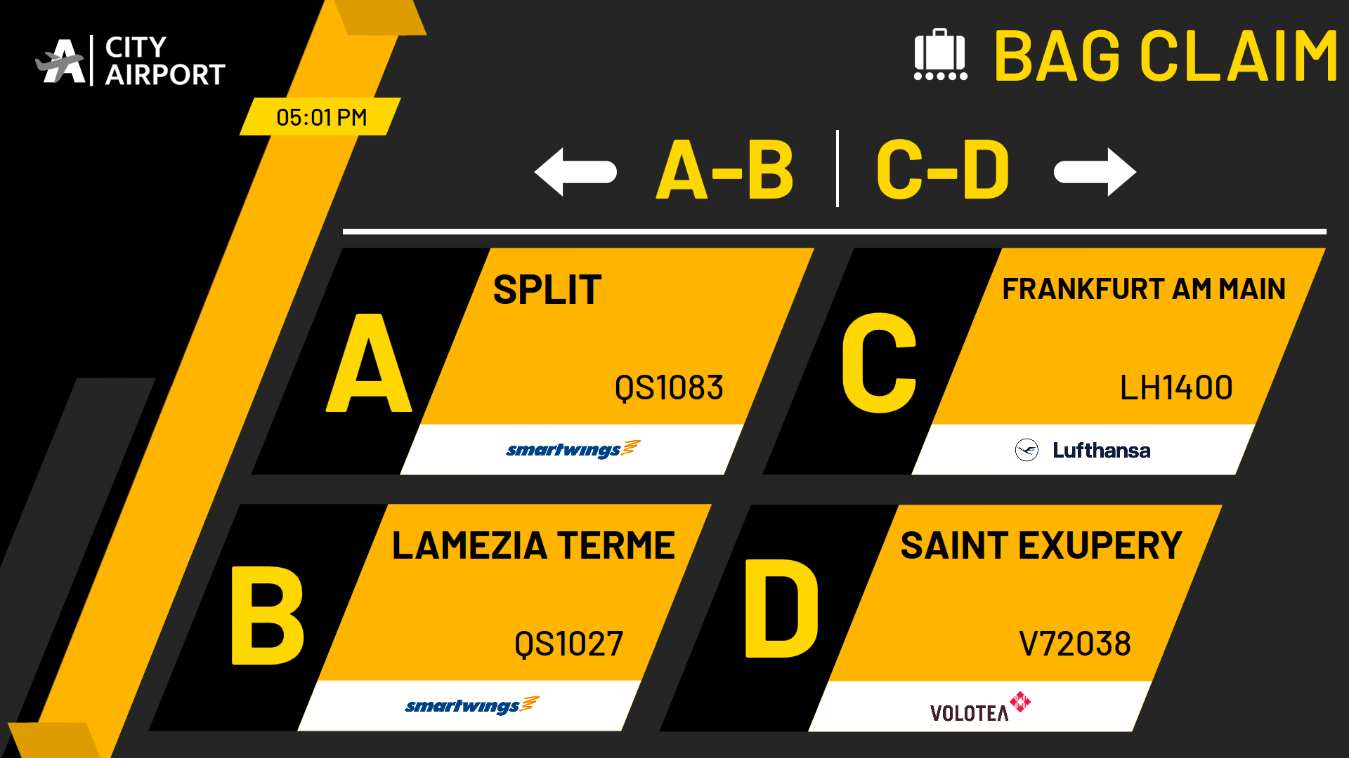
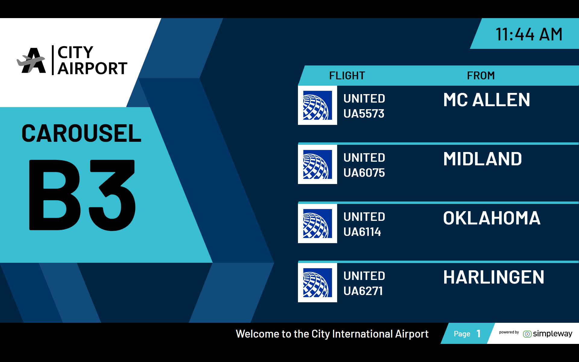
Here you'll find templates to suit every aesthetic preference and functional requirement, from sleek and modern designs to more traditional layouts. Whether you manage flight lists, check-in desks, gate assignments, or baggage carousels, our templates offer versatile solutions to meet your airport's unique needs.
Conclusion
Accessibility is a core value that underpins our continuous efforts to improve and innovate. We strive to create an inclusive environment where every passenger feels valued and respected. With the introduction of new accessible templates, we want to pave the way for a more inclusive future of air travel.
Join us in our mission to redefine accessibility standards in the airline industry. Check out our new templates today and experience the difference firsthand.
Contact us to embark on your journey to aviation excellence.


